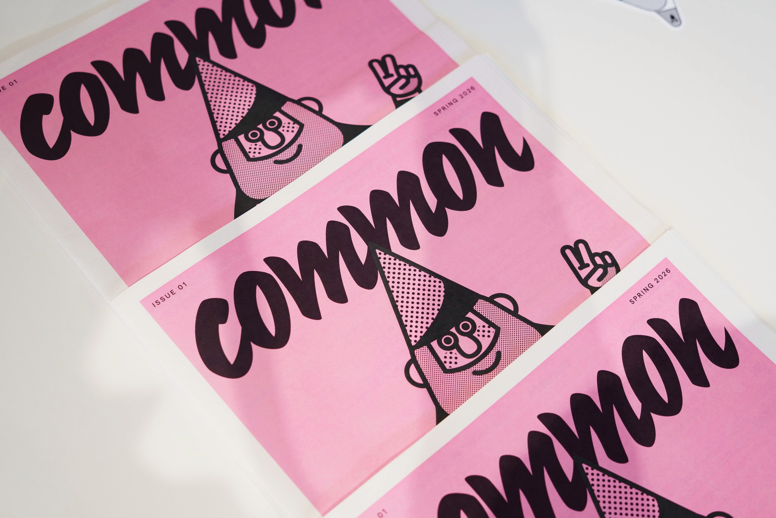
Common

A collaborative architecture anti-journal.

2026

Common is not an architecture journal. It is an anti-journal: a space for the ideas, reflections and discussions that sit beside the physical product of architecture and design. A truly collaborative piece: we worked alongside GPAD to turn their concept into a brand and editorial style.

What we did

Illustration Placemaking Design Direction

Co-ordinated and created by
GPAD

Photography by
Stefan Jakubowski

Pink newsprint cover of Common listing article titles above an illustrated character in a pointed hat

Illustration style

Illustrations for this issue of Common focused on the ordinary objects we encounter and the creatures that inhabit our everyday world. From pigeons navigating urban spaces to worms burrowed deep within an unsuspecting apple, they invite us to notice the life woven into the seemingly mundane.

Together, these images celebrate the small, often overlooked, moments that surround us.

Halftone illustration of a green apple with two smiling cartoon worms poking out
Common issue 01 on a white mesh chair, its pink cover showing an illustrated gnome making a peace sign
Common spread on carbon and collaboration, with a pull quote and photos of buildings and a timber structure in a field
Illustrated cluster of a tennis ball, flowers, starbursts, speech bubbles and a ticket in black, yellow and halftone
Stack of die-cut stickers of a halftone pigeon illustration on grey felt
Common open on a bench at a spread of colourful community projects, including a painted sports court from above
Framed Common cover with the pink gnome illustration leaning against bookshelves
Shop windows dressed for the Common issue 01 launch party with the wordmark and a large pigeon graphic
A reader in a blue jacket holds Common open at the contents and welcome pages