Habiko

Creating greener, more affordable homes.

2025

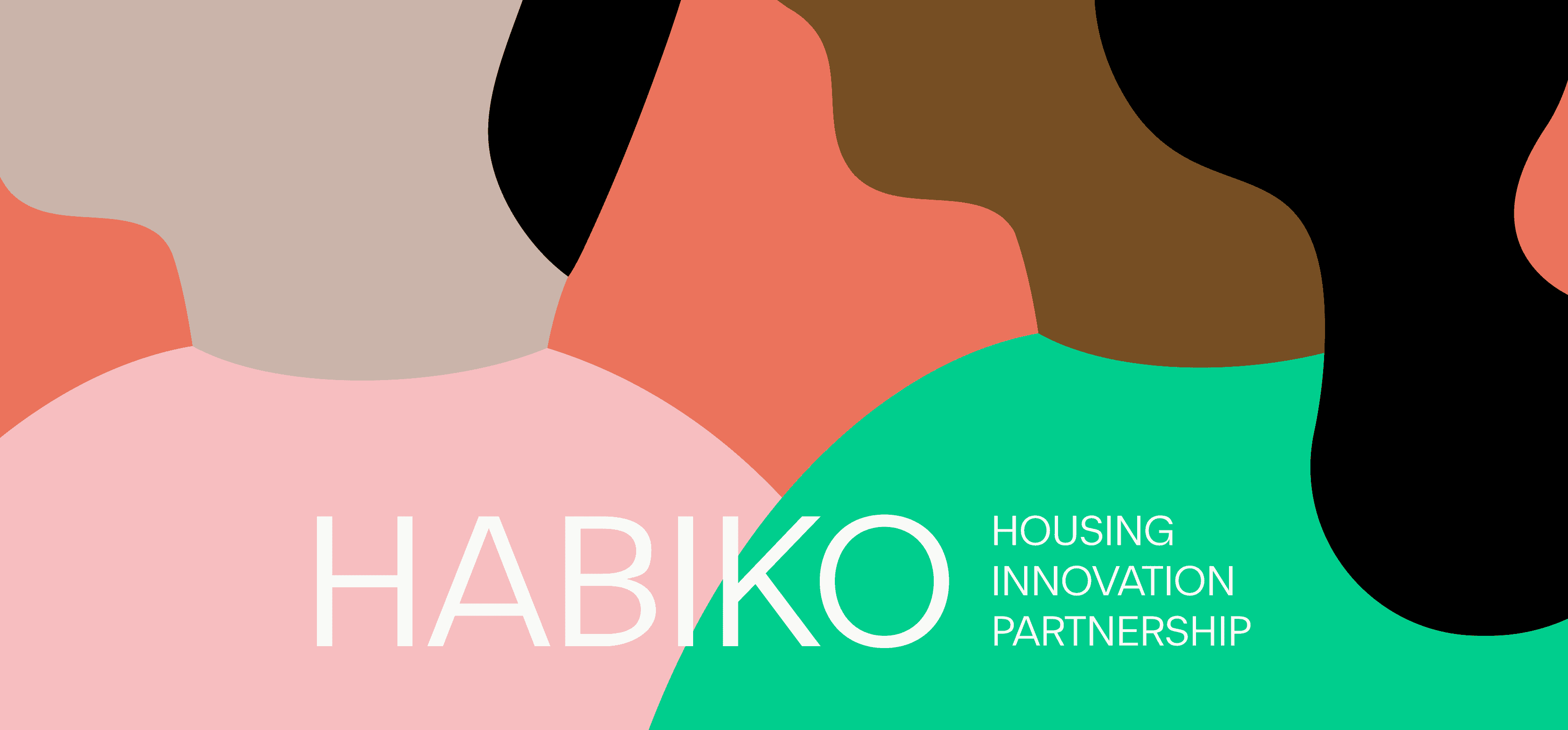
We worked with Habiko to define a brand strategy and identity that brings warmth and clarity to sustainable, affordable housing. A bold, modular visual system is paired with characterful, human illustrations that give the brand an approachable, grounded personality.

What we did

Brand Strategy Visual Identity Web Design & Dev Illustration

Turning a bold housing vision into a clear, human brand

Habiko is a joint venture between Muse Places, Homes England and Pension Insurance Corporation. Together, they aim to deliver 3,000 low-carbon, affordable homes for rent, combining long-term investment, public-sector expertise and best-in-class placemaking.
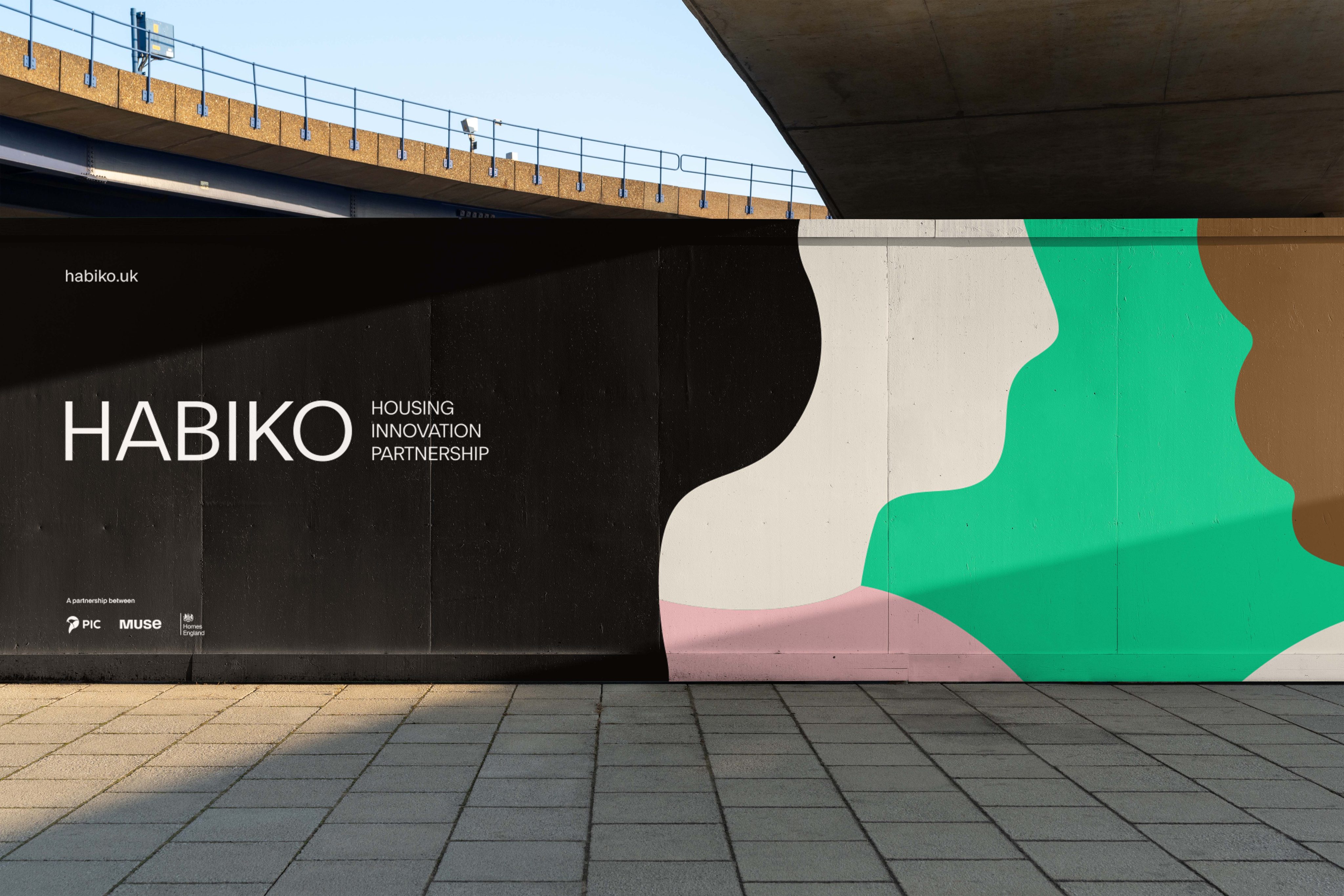
Habiko Housing Innovation Partnership hoarding beneath a flyover, with green, pink and brown shapes
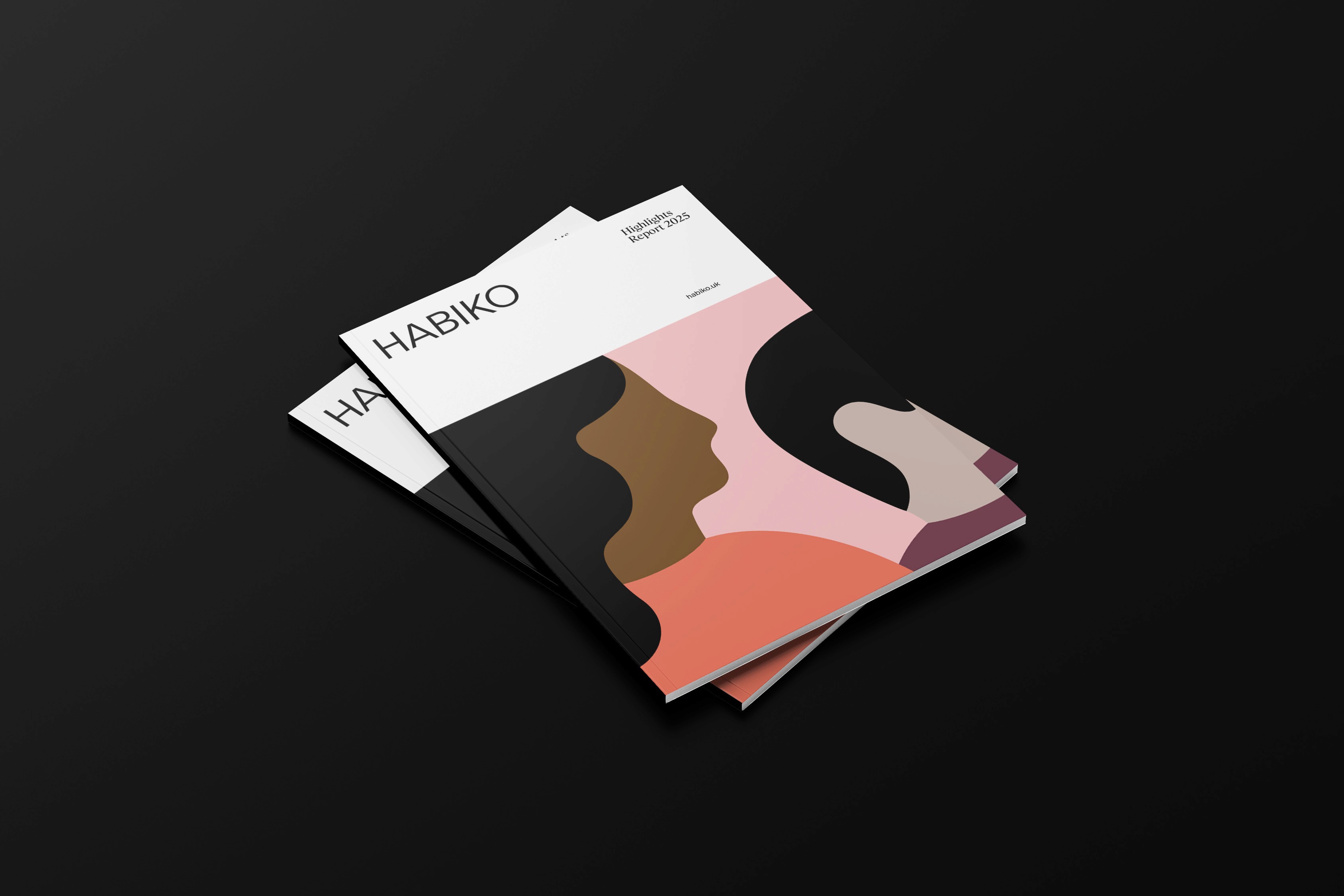
Stacked Habiko reports with covers showing overlapping illustrated profiles in pink, brown and black
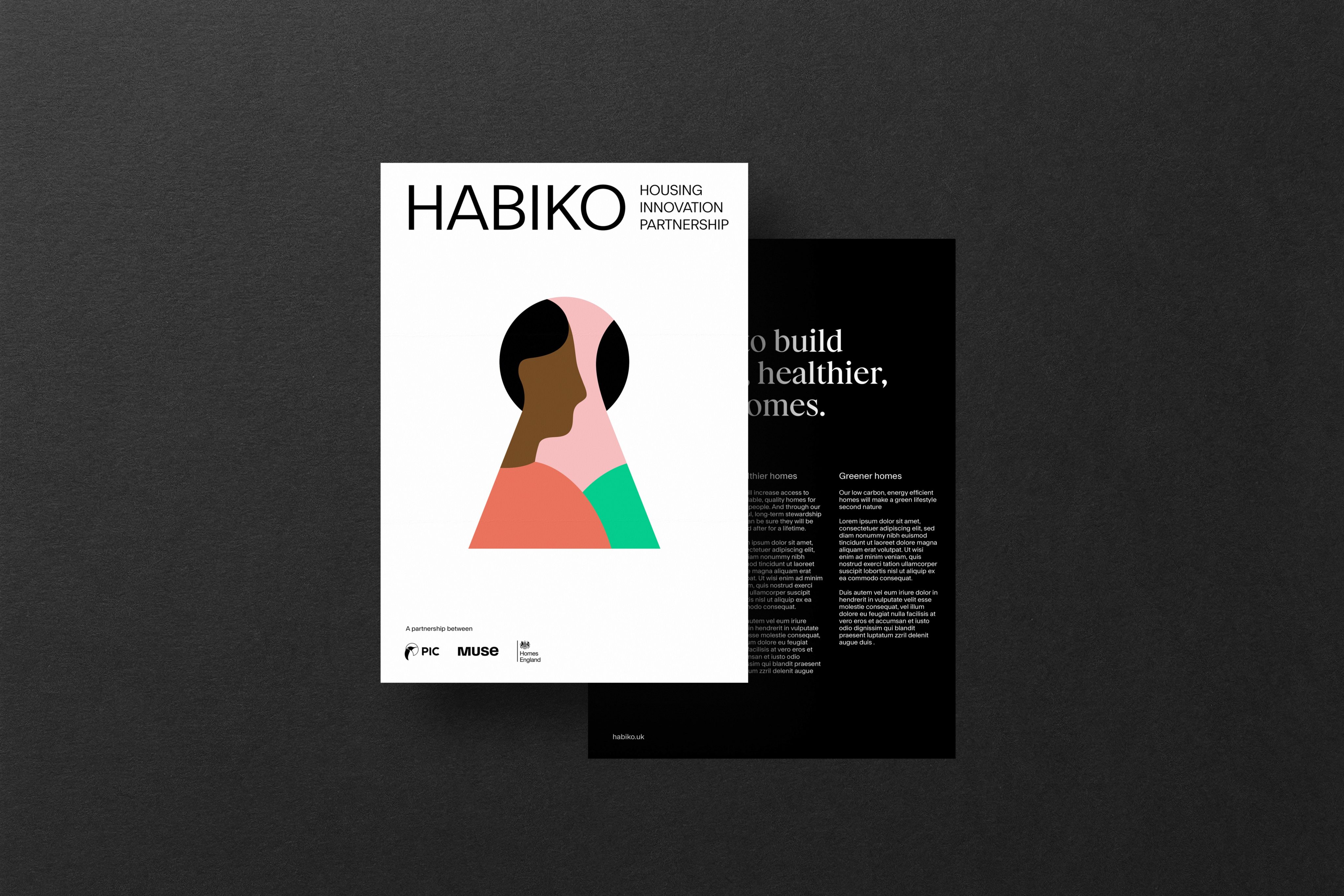
Habiko leaflet cover with a figure framed in a keyhole shape, beside a black text page
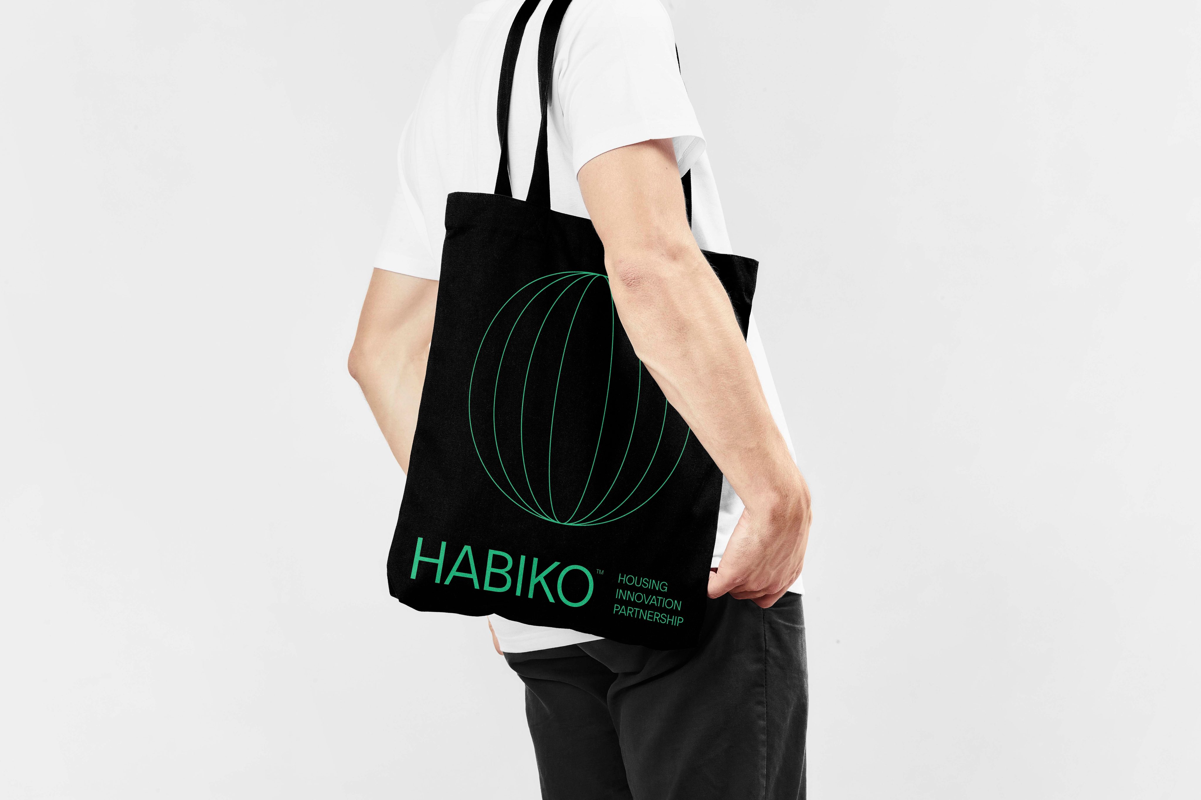
Black Habiko tote bag with a green line-drawn globe, carried over a shoulder
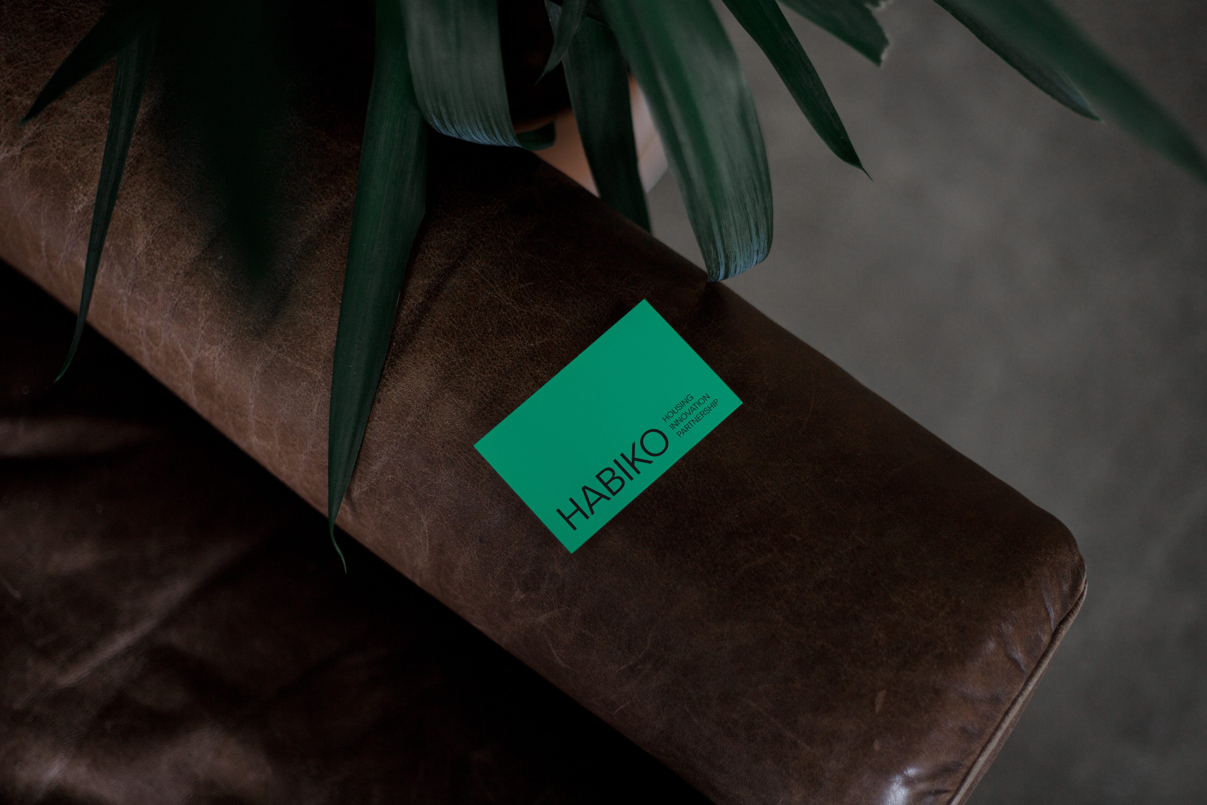
Mint-green Habiko business card on a brown leather sofa arm beneath plant leaves
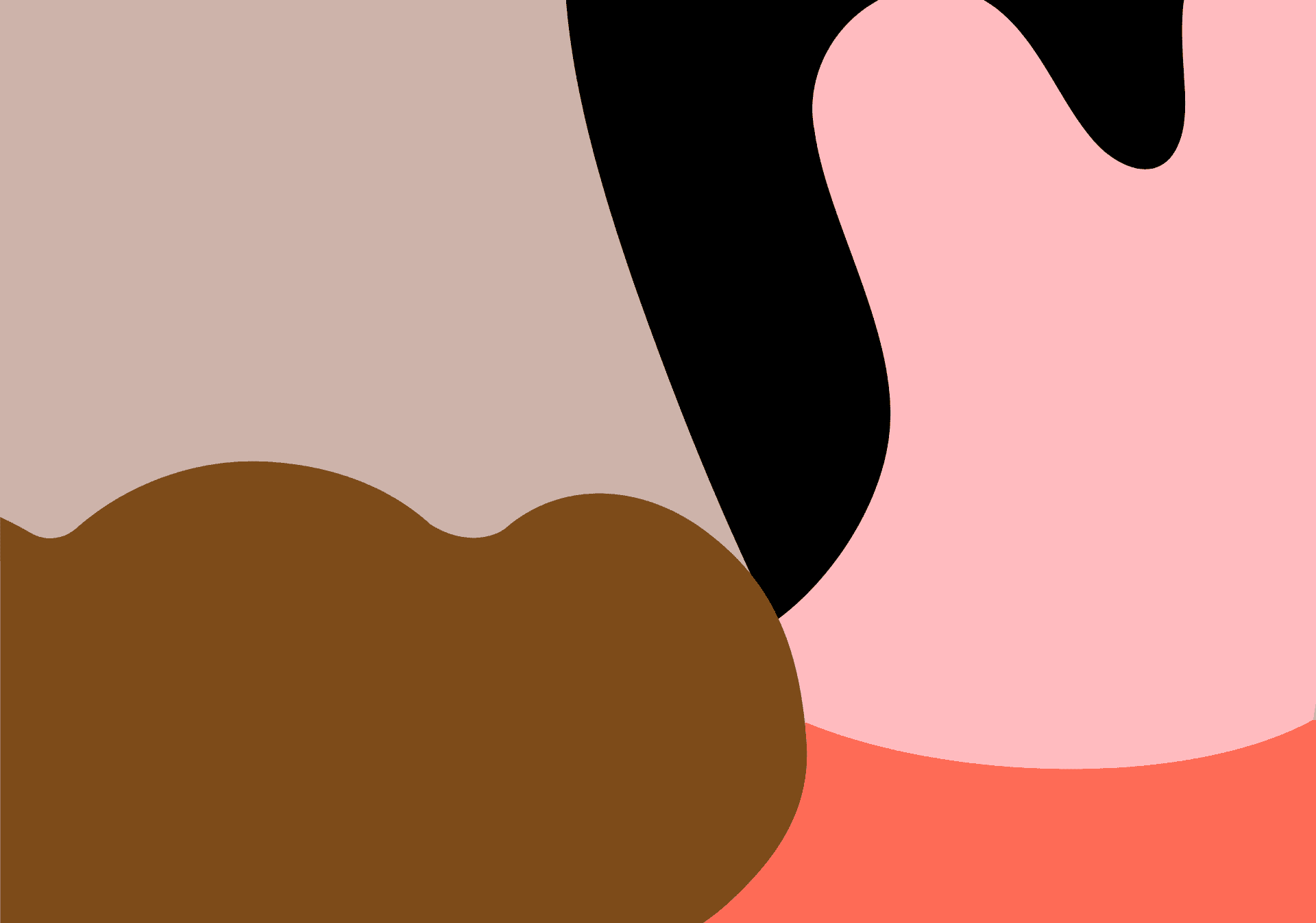
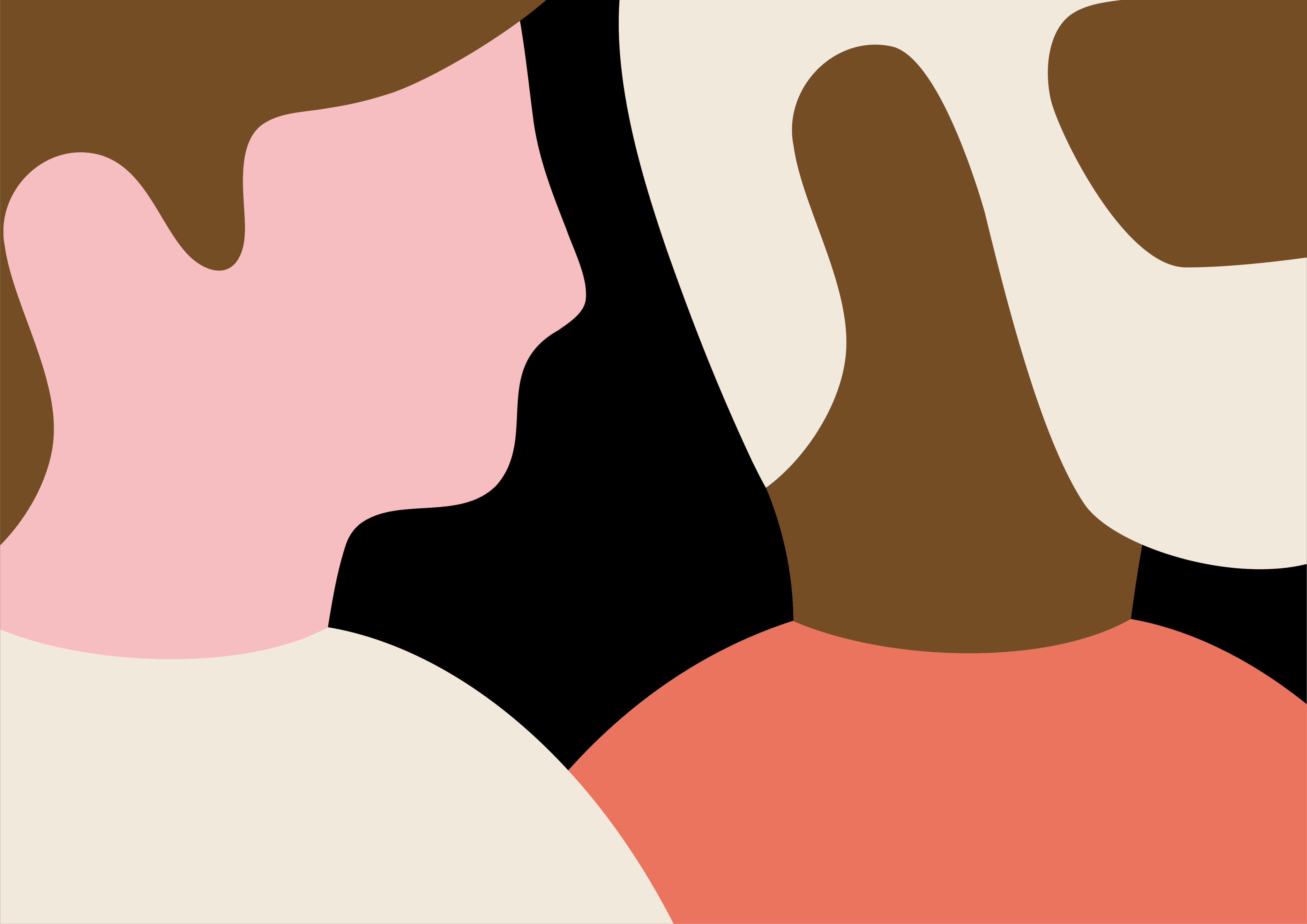
Close-up of abstract illustrated shapes in taupe, chestnut, black, pink and coral
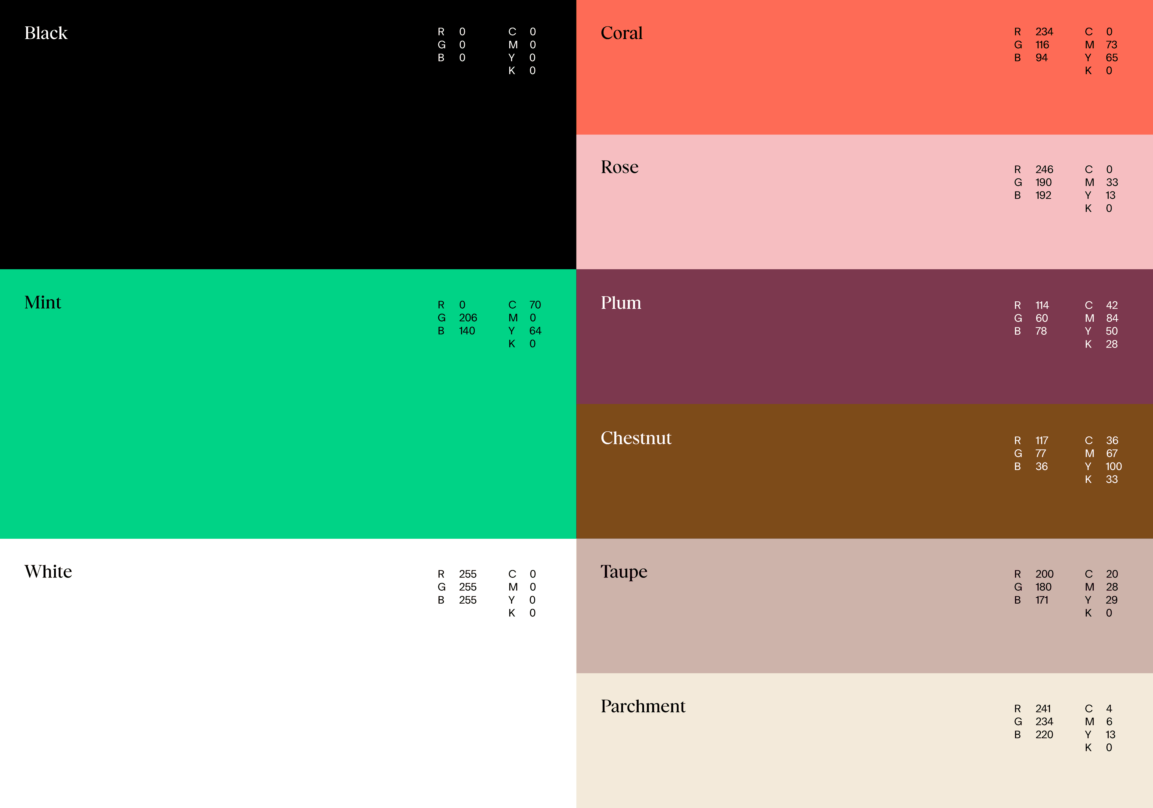
Habiko colour palette: Black, Mint, White, Coral, Rose, Plum, Chestnut, Taupe and Parchment
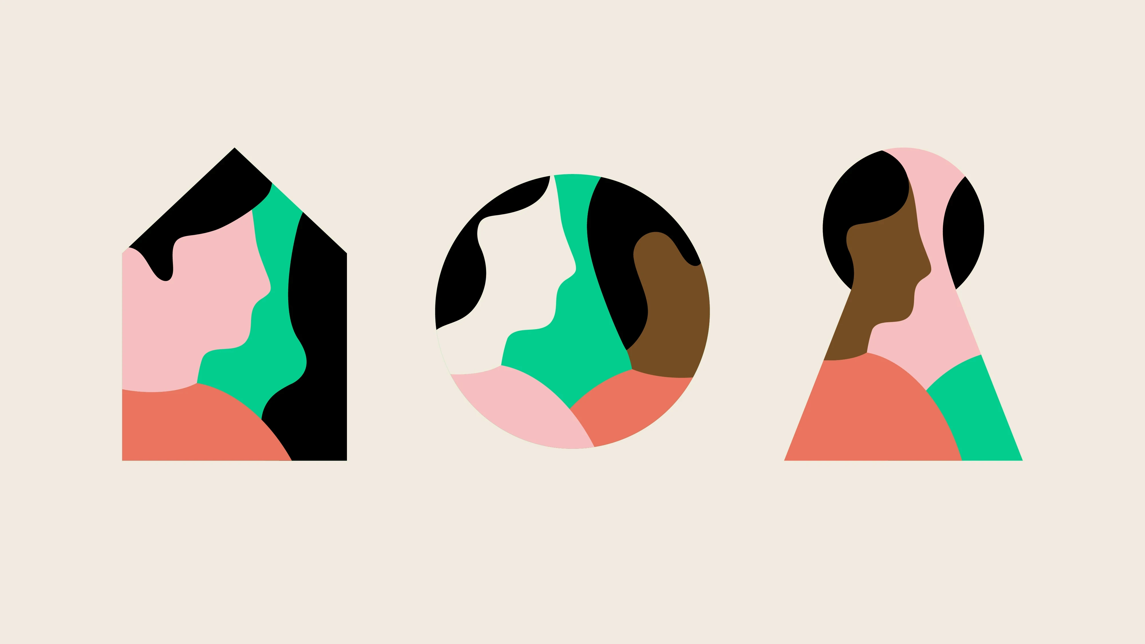
Three illustrated profiles framed in a house, a circle and a keyhole shape on cream
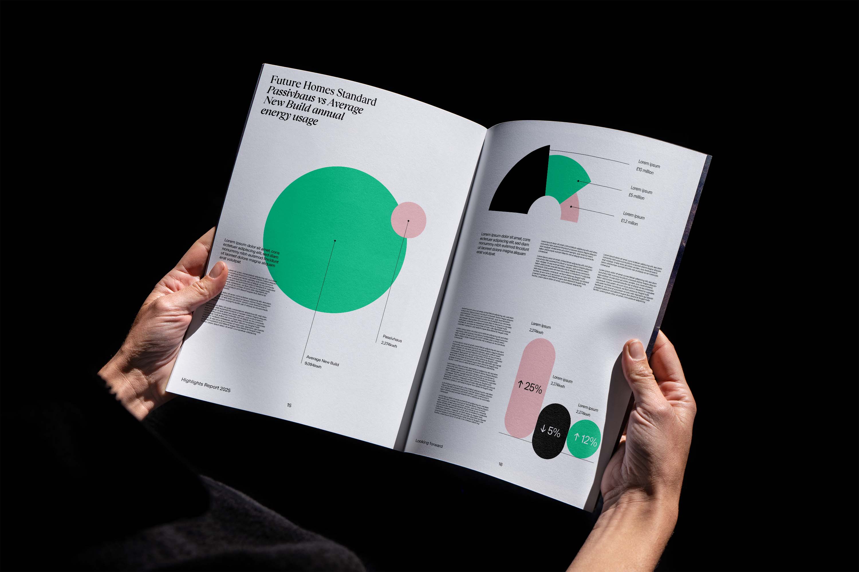
Hands holding an open report with green and pink charts on Passivhaus versus average new-build energy use
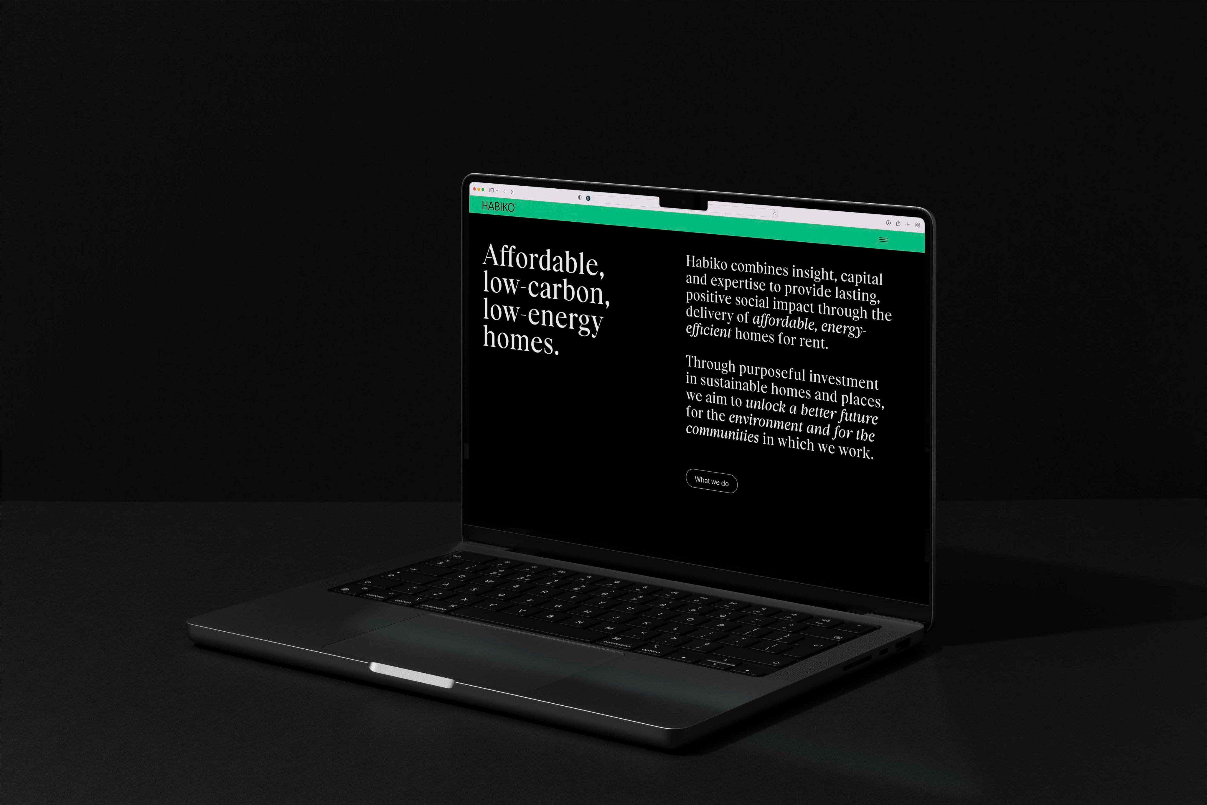
Laptop showing the Habiko website headline 'Affordable, low-carbon, low-energy homes'
Close-up of two overlapping illustrated figures in pink, chestnut, cream, coral and black