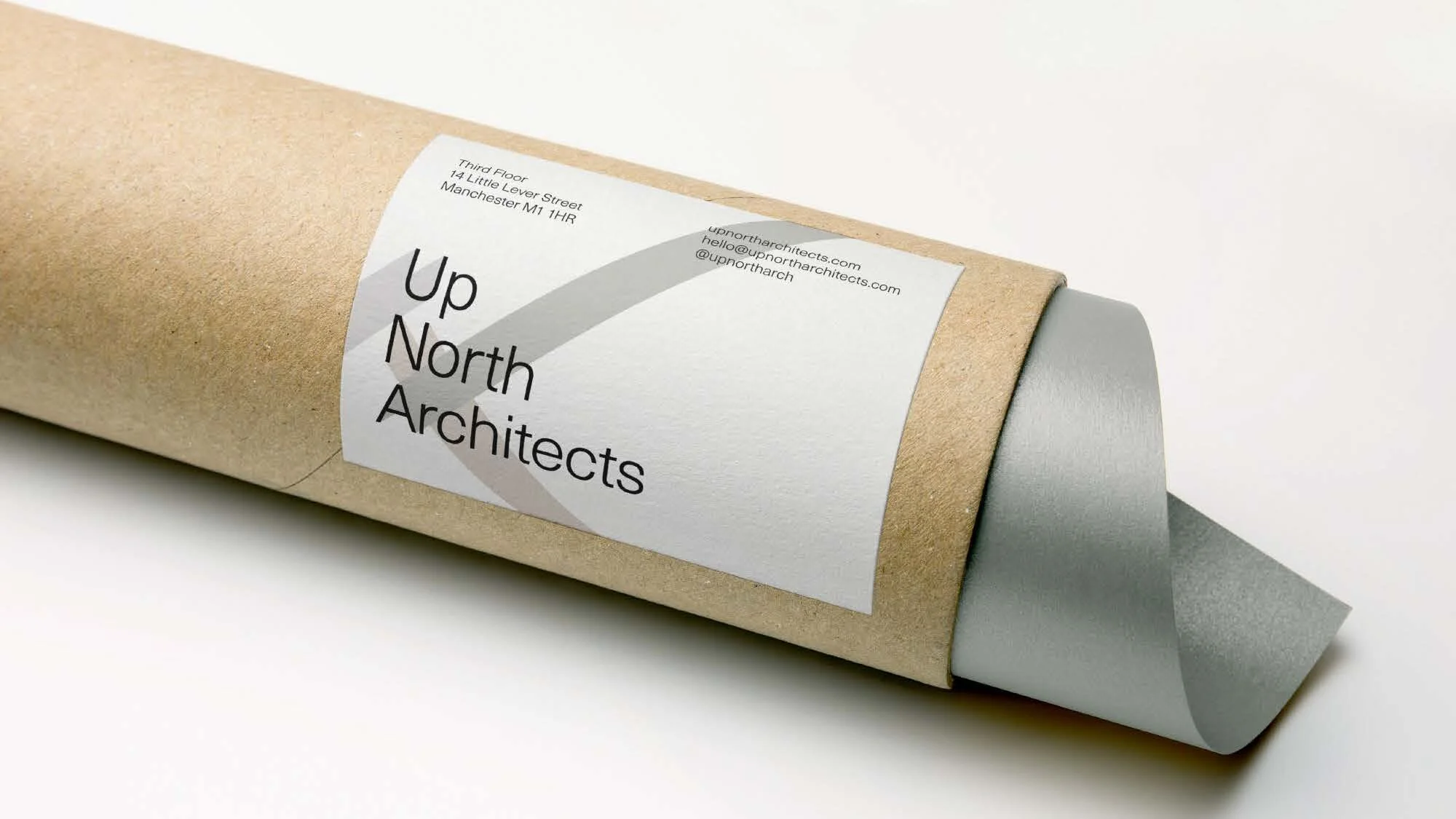
Up North Architects

Flexible identity for friends and collaborators UNA.

2017

UNA is driven by possibility – each project starts as a question, not a formula. We designed a visual identity that can flex, twist and reframe itself to match the many paths their work might take. The marque is deliberately agile; the systems around it allow room for surprise, iteration and evolving context. Alongside that, we built their website so that each project can tell its own visual story – no two looks the same, but all unmistakably UNA.

What we did

Visual Identity Web Design & Dev
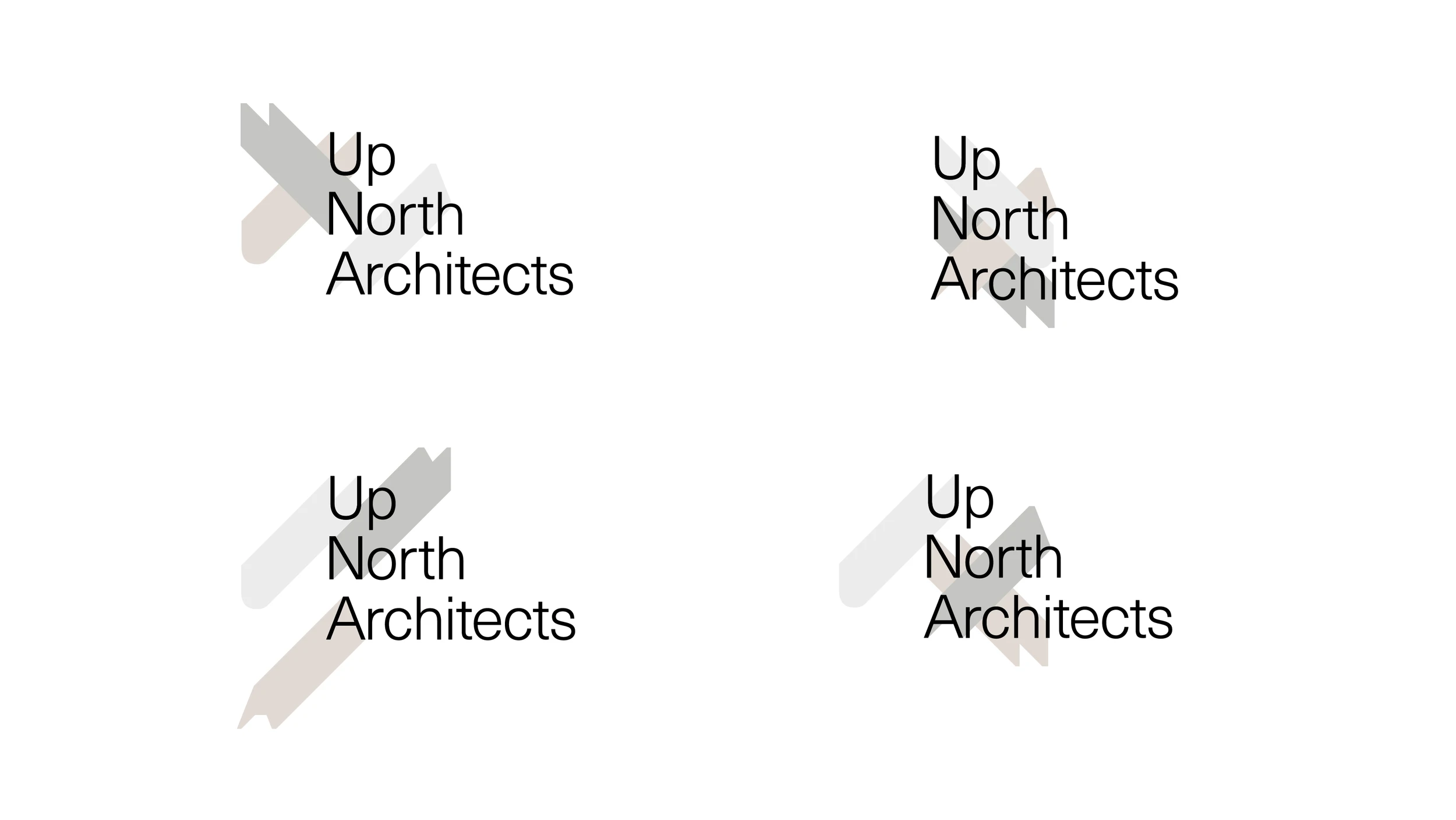
Four versions of the Up North Architects logo with shifting translucent strokes
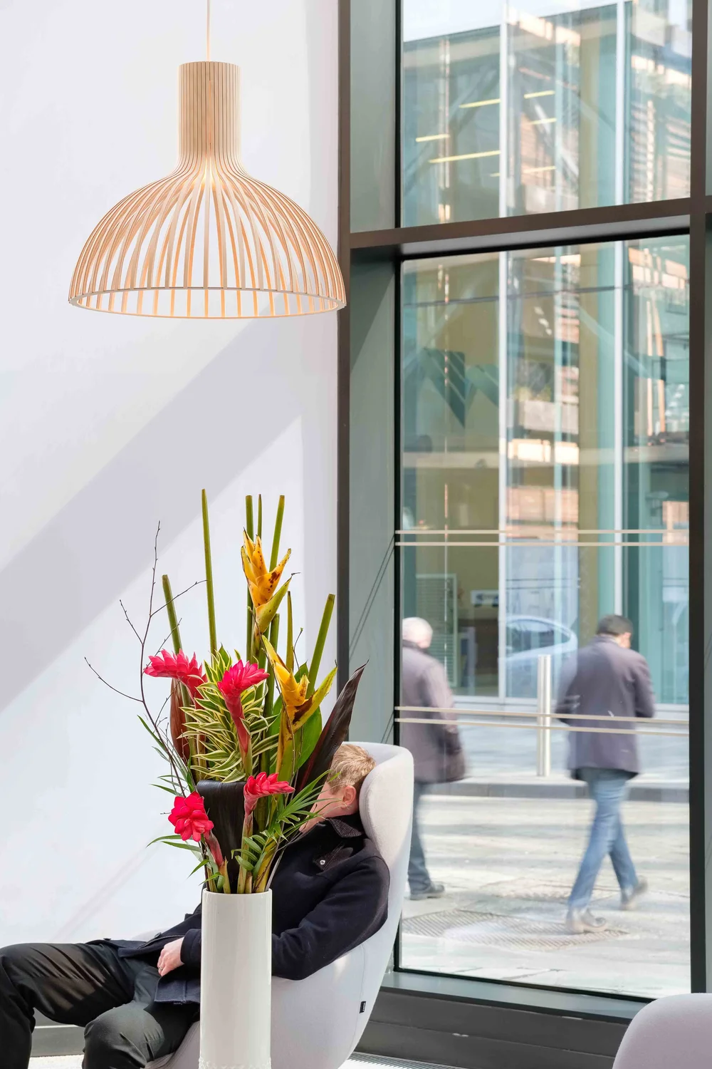
Bright lobby with a pendant lamp and tall flower arrangement as people pass the window
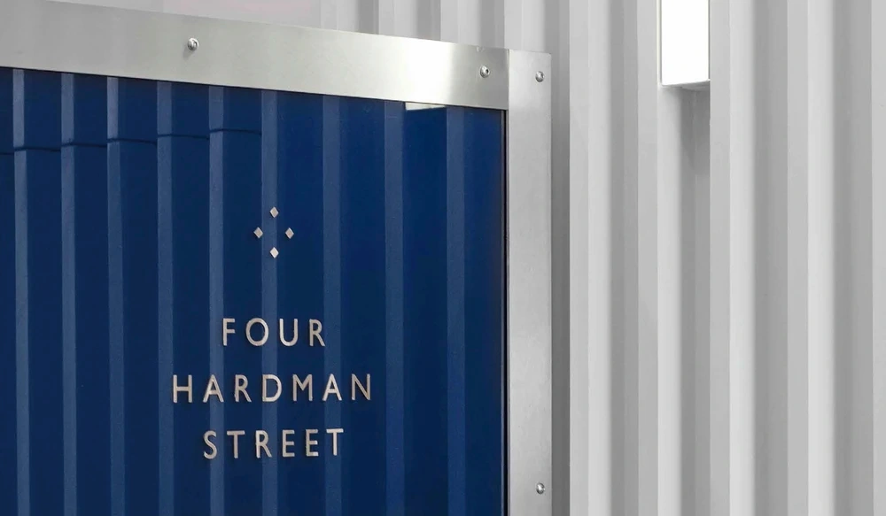
Four Hardman Street sign in silver lettering on a blue panel
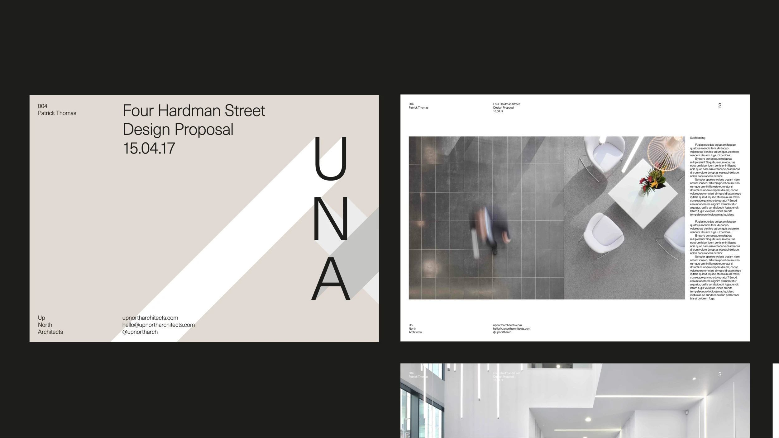
Up North Architects design proposal for Four Hardman Street, with a UNA cover and an interior photo spread
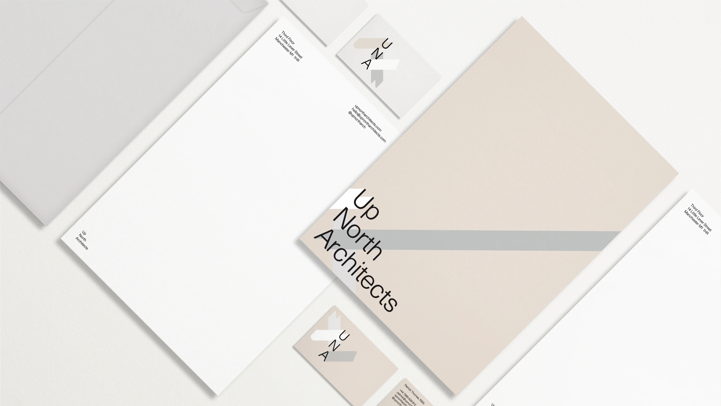
UNA stationery set with letterheads, business cards and a cover
Up North Architects name in large type on a folded white sheet